

目次
分析
では、実際にクラスタリングを実行していきたいと思います。
k-meansについて
分析の前に、k-meansについて説明したいと思います。
1. ユークリッド距離の計算
ユークリッド距離は、二点間の直線距離を計算する公式で、以下の式で表されます:
$$d(\mathbf{x}, \mathbf{y}) = \sqrt{\sum_{i=1}^n (x_i – y_i)^2}$$
2.クラスタリングの目的関数
K-means クラスタリングの目的は、クラスター内の全ての点のセントロイドからの距離の総和を最小化することです。
これは次の式で表されます:
$$J = \sum_{i=1}^k \sum_{\mathbf{x} \in S_i} | \mathbf{x} – \mathbf{\mu}_i |^2$$
ここで、\(k\) はクラスターの数、\(S_i\) はクラスター \(i\) に割り当てられたデータポイントの集合、\(μ_i\) は
クラスター \(i\) のセントロイド(平均ベクトル)です。
3.セントロイドの更新
各イテレーションでのセントロイドの更新は、クラスターに割り当てられた点の平均に基づいて行われ、以下の式で計算されます:
$$\mathbf{\mu}i = \frac{1}{|S_i|} \sum{\mathbf{x} \in S_i} \mathbf{x}$$
ここで、\(\in_Si\) はクラスター \(i\) に割り当てられた点の数です。
実装
では実装に入っていこうと思います。
from sklearn.cluster import KMeans
from sklearn.preprocessing import StandardScaler

# データ前処理
scaler = StandardScaler()
features = data[['Age', 'Visit Frequency', 'Average Spending']]
features_scaled = scaler.fit_transform(features)

# K-means クラスタリング
kmeans = KMeans(n_clusters=3, random_state=42)
clusters = kmeans.fit_predict(features_scaled)
data['Cluster'] = clusters
ID以外のデータを標準化して、学習させています。
作成されたクラスターの番号を元データの列にClusterとして追加しています。
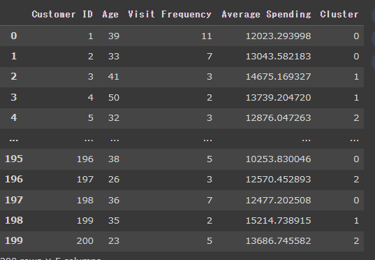
結果、以下のように各顧客にクラスタ番号が割り振られたデータフレームが作成されます。
次に平均単価と、来店回数について、クラスタごとに色分けして可視化してみます。
plt.figure(figsize=(10, 6))
sns.scatterplot(data=data, x='Visit Frequency', y='Average Spending', hue='Cluster', palette='viridis', alpha=0.6)
plt.title('Customer Segmentation based on Visit Frequency and Average Spending')
plt.xlabel('Visit Frequency')
plt.ylabel('Average Spending')
plt.legend(title='Cluster')
plt.grid(True)
plt.show()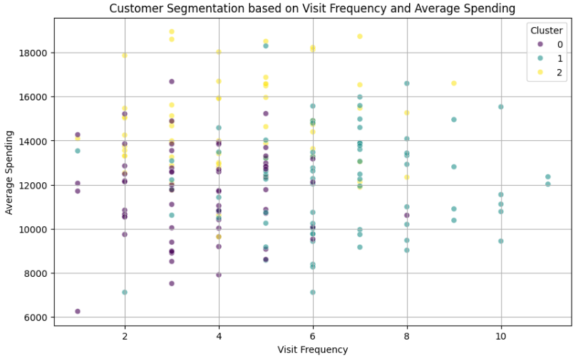
あまりきれいではありませんが、ザックリ
クラスタ0:低頻度低単価の顧客層
クラスタ1:高頻度高単価の顧客層
クラスタ2:中頻度高単価の顧客層
と分類できそうですね!
たとえばですが、クラスタ0には「単価アップメニューをおすすめしてみる、来店タイミングのお知らせを送ってみる」、クラスタ1やクラスタ2には「継続を促す施策を実行する」などのクラスタ別のマーケティングアプローチが考えられます。
次に、年齢と来店回数の2軸で可視化してみます。
plt.figure(figsize=(10, 6))
sns.scatterplot(data=data, x='Age', y='Visit Frequency', hue='Cluster', palette='viridis', alpha=0.6)
plt.title('Customer Segmentation based on Age and Visit Frequency')
plt.xlabel('Age')
plt.ylabel('Visit Frequency')
plt.legend(title='Cluster')
plt.grid(True)
plt.show()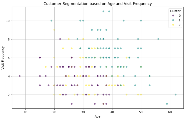
クラスタ0は年齢が若く頻度が小さい、クラスタ1は年齢が高く来店回数が多い、クラスタ2はその中間、と言えそうですね。
次に、年齢と平均単価の2軸で可視化してみます。
plt.figure(figsize=(10, 6))
sns.scatterplot(data=data, x='Age', y='Average Spending', hue='Cluster', palette='viridis', alpha=0.6)
plt.title('Customer Segmentation based on Age and Average Spending')
plt.xlabel('Age')
plt.ylabel('Average Spendingy')
plt.legend(title='Cluster')
plt.grid(True)
plt.show()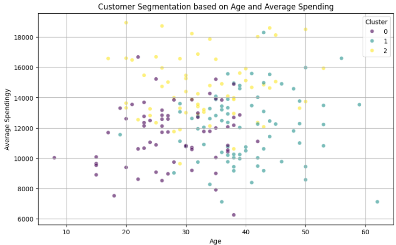
上記の可視化を3軸いっぺんに3次元で表示してみます。
from mpl_toolkits.mplot3d import Axes3D

# 3Dでの可視化
fig = plt.figure(figsize=(12, 10))
ax = fig.add_subplot(111, projection='3d')

scatter = ax.scatter(data['Visit Frequency'], data['Average Spending'], data['Age'],
                     c=data['Cluster'], cmap='viridis', marker='o')

ax.set_xlabel('Visit Frequency')
ax.set_ylabel('Average Spending')
ax.set_zlabel('Age')
ax.set_title('3D Visualization of Customer Segmentation')

# 凡例の追加
legend = ax.legend(*scatter.legend_elements(), title="Cluster")
ax.add_artist(legend)

plt.show()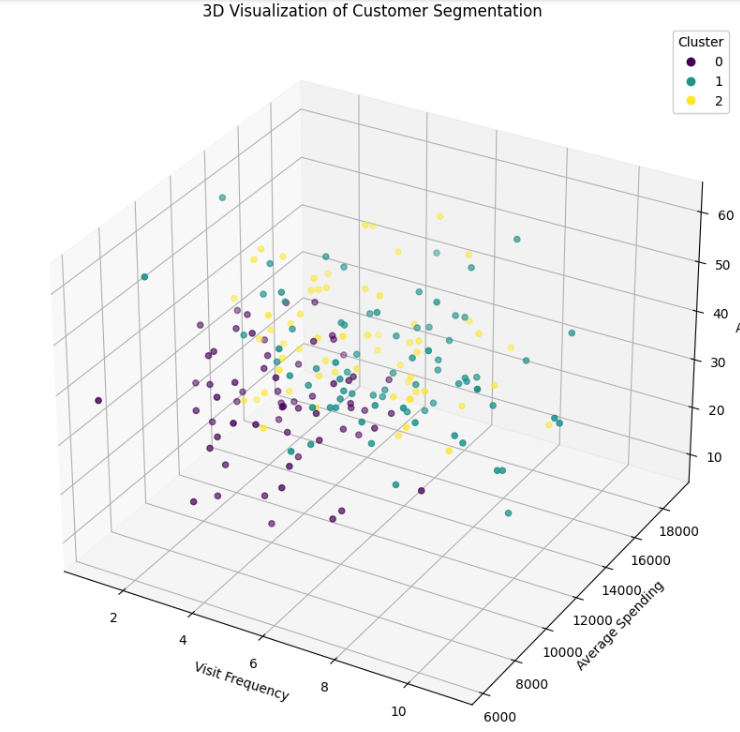
最後に、各クラスタの顧客ID名簿を取得します。
こうすることで、各クラスタのアプローチすべき具体的な顧客がわかりますね!
# 各クラスターの顧客ID名簿
cluster_rosters = data.groupby('Cluster')['Customer ID'].apply(list).reset_index()
cluster_rosters
以上、今回はクラスタリングを美容室の経営に用いてグループごとのアプローチを考えてみました。
近い特徴の顧客同士でグループ化することで、今まで気が付かなかったことに気が付くことがあるかもしれません。
マーケティングに活用できる面白い分析手法だと思います。
参考文献
多変量解析入門――線形から非線形へ
小西 貞則 (著)
Python 実践AIモデル構築 100本ノック
下山輝昌 (著), 中村智 (著), 高木洋介 (著)